Paint LRV & Undertone Picker Tool
This paint LRV (light reflectance value) & undertone color picker tool helps people avoid paint mistakes by understanding how different hues will behave in a room. The calculator shows how your choices react to lighting, finishes, and trim so you can make the best decision.
Paint LRV & Undertone Picker
Avoid expensive paint mistakes with clear, visual decisions
How the Paint Light Reflectance Value And Undertone Tool Works
Most paint mistakes don’t happen because people pick a “bad color.” Instead, they happen because the color doesn’t work the way they expected. Instead of asking you to guess your color based on tiny paint chips or confusing names, this tool shows paint results based on the two things that matter most:
- How much light the color reflects (LRV)
- What undertone actually shows up when on the wall
Here’s how each part of the tool works, so you can use it and get results that help.

Upload a photo and get instant before-and-after room designs.
No design experience needed — join 2.39 million+ happy users.
👉 Try the AI design tool now
Step 1: LRV Slider: Understanding Light, Not Just Color
LRV or Light Reflectance Value measures how much light a color reflects on a scale from 0 to 100. However, most people don’t think in numbers like this; they think in rooms that feel too dark, flat, or washed out. That’s why the tool translates LRV into the following categories:
- 0–10: Nearly black
- 11–30: Dark
- 31–50: Mid-tone
- 51–70: Light
- 71–90: Very light
- 91–100: Near white
You’ll also see a simple rule of thumb that’s used throughout the tool:
Below 50 = absorbs light. Above 60 = reflects light well.
Why this matters: A color can still make a room feel smaller or dimmer if the LRV is too low for the space it’s used in. The slider helps you spot this problem before you paint.

Step 2: Undertone Selector: The Real Decision Maker
The paint’s undertone is where most paint regret comes from. Two colors can look nearly identical on a paint chip, but then behave completely differently on the wall. This is because they may have different undertones. This tool lets you choose from undertone families that designers use, so you won’t be surprised later.
- Warm (yellow, red, or orange base)
- Cool (blue, green, or violet base)
- Neutral
- Greige (balanced warm/cool)
- Green-leaning neutral (a major troublemaker)
- Pink-leaning neutral (another common surprise)
Each option explains:
- What the color really looks like once it’s painted
- What it tends to clash with
What finishes and materials it works best alongside.
For example:
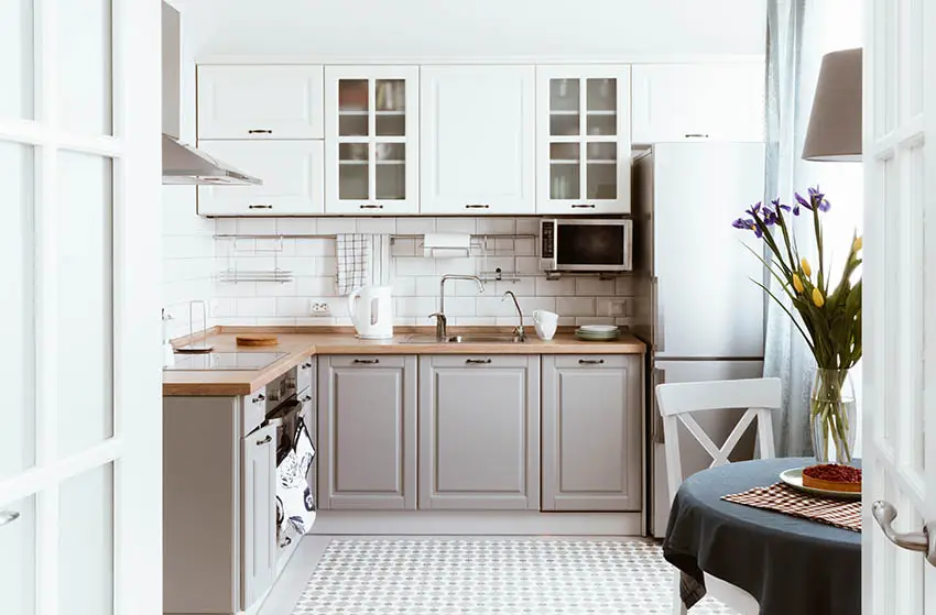
- Green undertones can look muddy next to red brick or with warm wood.
This step explains and removes many of the moments when you wonder why a paint looks weird and not quite right.
Step 3: Instant Color Behavior Preview: How the Color Changes
Paint doesn’t stay the same all day as the lighting conditions continually change depending on the time of day. The room’s lighting changes everything. Once you choose an LRV and undertone, the tool previews how the color should behave under the following conditions:
- Daylight vs evening light
- North-facing vs south-facing rooms
Even a simple visual preview makes a huge difference. It can shift your thinking from “Do I like this color?” to “Will this color even work in my room?” That’s a much better question to answer before you buy a product and paint the room.
Step 4: “Good / Risky / Avoid” Verdict: Designer-Level Guidance
After your selections, the tool gives you a clear verdict:
- Best uses
- Risky scenarios
- Avoid if…
For example:
- Avoid the hue if your space has lots of warm beige tile or yellow lighting.
This is where the tool stops feeling like a calculator and starts feeling like expert advice you can use.
Step 5: Real-World Pairing Compatibility Checker
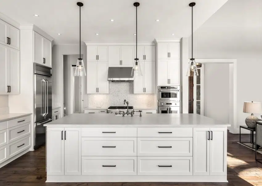
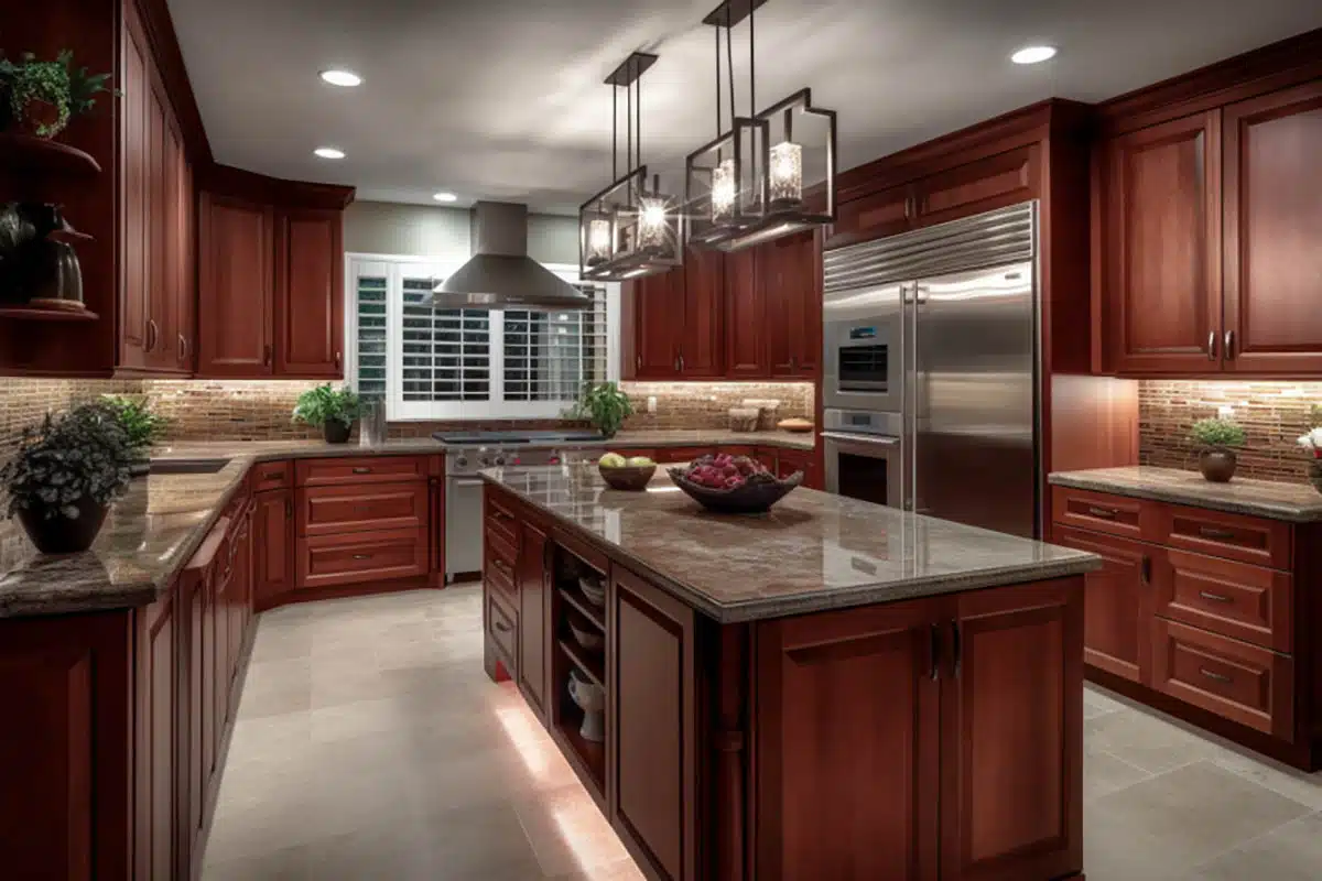
Paint never exists by itself; it has to work with everything around it. That’s why the tool lets you check if the hue works with the most common finishes, such as:
- Warm wood floors
- Cool gray floors
- White quartz
- Creamy stone
- Stainless steel
- Brass hardware
For each pairing, you’ll see:
- Works well
- Needs testing
- Likely clash
This mirrors how designers evaluate paint in real homes.
Step 6: White & Off-White “Danger Zone” Detection
Whites are the hardest colors to get right. The tool pays attention to LRVs between 80 and 92, where most white and off-white mistakes happen. It calls out issues like:
- This white will read cream next to true white trim.
- This off-white may look dirty under LED lighting.
If you’ve ever painted a room white and felt like it didn’t work out, this section explains why and prevents you from repeating it.
Step 7: Trim & Ceiling Recommendations: So There’s No Guessing Required
To reduce the fatigue of making too many decisions, the tool also suggests trim and ceiling finish so you get what looks best.
What This Tool Is (and Isn’t)
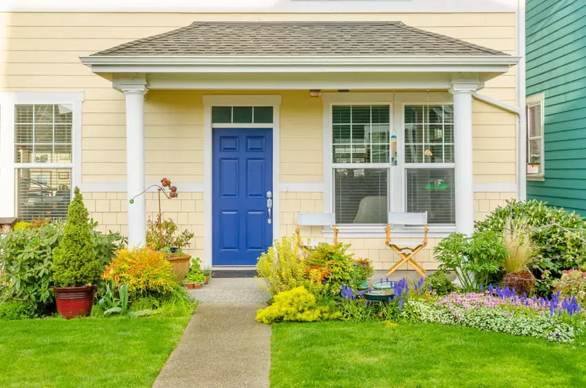
This tool does not pick a paint color for you; it helps you avoid picking the wrong one. The paint LRV & Undertone Tool is for entertainment value only. Please use your own due diligence when purchasing paint to ensure you get what’s right for your living and lighting conditions.
It’s designed to:
- Predict real-world behavior
- Highlight risks before you paint
- Make confusing paint decisions feel easier
Always make sure to test the color in your actual space in a small area where you can see it at different times of the day and under a variety of lighting conditions before committing.
To showcase highly specific designs, some images on this website use advanced AI-generation software to illustrate ideas and room inspiration. See our editorial policy to learn more.